Hi!
First of all, I hope you had a great New Year and a great start to 2024! Here in Michigan, we’ve had nearly endless clouds and rain - so if you’ve been getting sun or even snow, I’m jealous. (Maybe you could send some of your good weather my way?)
Also, thanks to everyone who shared their photography goals for 2024 - I very much enjoyed reading each
email!
In this newsletter, I share:
- A few dPS articles to jumpstart your photography in 2024
- The dPS bi-weekly challenge
- Three more photo critiques
So without further ado, let’s get started!
Essential dPS Articles to Read
When you’re delving into photography for the first time, it’s easy to skip over the fundamentals and head straight for the fun stuff.
But here’s the truth:
Once you master your photography fundamentals, you’ll be able to do so much more with your camera. You’ll know how to create beautiful
exposures, consistently. You’ll understand how to capture crisp, clear shots, no matter your equipment. You’ll know how to produce beautiful background blur in a variety of shooting scenarios.
If all that sounds good, then I’d encourage you to give these three dPS articles a read:
- Exposure in Photography: Everything You Need to Know. Not sure how to capture images with plenty of detail in the shadows and the highlights? As the title suggests, this article explains it all.
- Camera Modes Explained for Newbies. Confused by the options on your camera mode dial? This article will clear everything up!
- How to Take Sharp Images. Ever feel like your photos aren’t sharp enough? This article offers 17 different strategies for keeping your images looking crisp!
Once you understand the information shared in those articles, you’ll be well on your way to becoming a
photography expert.
The dPS Bi-Weekly Challenge: Best of 2023
From Sime:
Well, here we are in 2024!
We do this almost every year, the old "share your best or most favourite photograph of the last year" Now, keep in mind that it doesn't have to be the most polished photograph, doesn't have to be taken with the best gear (gotta be a camera / phone and not Ai!) just your best or most favourite photograph. Blurry, Sharp, whatever - it's your moment to share something that means something to YOU. #dPSBestOf2023
Make sure you include the hashtags
#dPSWeeklyChallenge and #dPSBestOf2023 in your post, whether it’s in the comments of our official weekly challenge page or over on social media. You can tag us on Facebook, Instagram, or Twitter!
And you can also share your image(s) in the dPS Facebook group!
Critiquing Your Photos
Thanks to everyone who sent in images for critique
this week - and as always, if you have an image that you’d like to see critiqued, simply hit Reply to this email and attach the file!
First up is a gorgeous urban landscape photo from Karon H:

I’m loving the detail here, Karon - the leaves and tree branches look wonderfully crisp, and I also like how you can just make out that single streetlamp in the distance. I also like the way the vegetation
frames the bridge without distracting from it, and how the shot transitions gradually from the ultra-sharp, high-contrast foreground to the soft, ethereal background. And, of course, the fog lends a wonderful mood to the entire scene!
While the overall composition is great - with the bridge cutting through the picture plane diagonally, and the framing foreground vegetation - I think that a slight adjustment or two could make the
image even more impactful.
I’m noticing that the right edge of the image feels a little cramped; that tree is butting up against the edge of the frame, especially toward the top. I’d love to see a tad more space there. Relatedly, there are a few out-of-focus branches in the top right corner, which are slightly distracting, and I also think that the empty sky at the top of the image perhaps takes up a little too much space,
especially given how textural the rest of the image feels.
One move here would be to crop down from the top, which would get rid of some of that empty sky and also deemphasize the out-of-focus branches. When shooting, you could also try taking a step or two to the left, which might eliminate the distracting branches and allow you to more easily add space along the right-hand side. (On the other hand, stepping to the left would
compress the bridge and might mess with the sense of ordered chaos you’ve created - but it’s worth a shot!)
But it’s a wonderful image even as it is, and thanks again for sending it in!
Next, we have a captivating bird photo from David B:
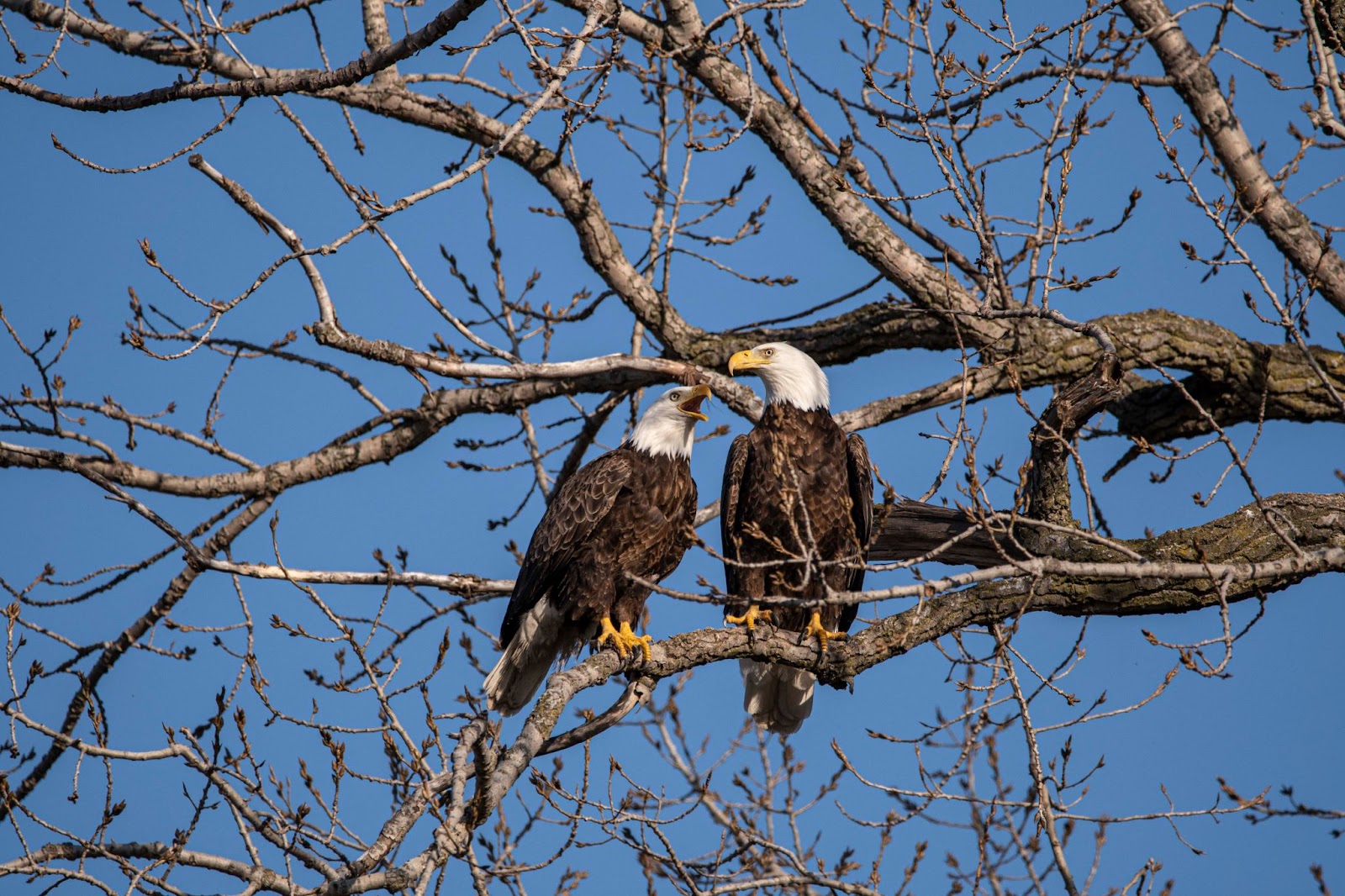
What a wonderful moment you’ve captured here, David - I love the interaction between the two eagles, and you’ve done a great job of catching the birds with perfect head poses (not only are both heads tilted slightly outward, but the eyes are tack-sharp and feature stunning catchlights!). You’ve also done a great job of ensuring that both birds are sharp from beak to tail - a combination, I think, of a fast shutter speed and a slightly narrower aperture setting.
My biggest recommendation here would simply be to emphasize the birds more. The moment is fantastic, but you’ve lost a little impact because the eagles are small in the frame. Of course, getting close is easier said than done, but it’s just something to keep in mind!
Alternatively, you could stick to the wider framing, but work on eliminating the branches and twigs
around the birds (especially the ones overlapping with their bodies). That’s probably not possible with this particular scene, but part of bird photography (and also photography more generally, of course) is admitting defeat when a scene isn’t quite right and choosing to wait or return when things are looking better.
That said, I still love the image, and it’s definitely one to be proud of!
Finally, we have a beautiful landscape photo from Claudia S:

I love this type of intimate landscape image, Claudia, and I especially like the painterly effect created by the colors in the background. I also think you’ve done a great job selecting a slow shutter speed;
it’s made the water silky smooth, and I love the leaf swirls in the bottom left!
I have two small suggestions for improvement:
- It looks like you’ve tilted your camera to the right so that the edge of the river is moving away from the picture plane. (In other words, the river’s edge is not parallel to the camera sensor, but is instead receding off into the distance.) I like how this adds a
sense of increased motion to the frame - dynamism is generally good! - but the right-hand side of the image feels a little empty as a result. When structuring an image, it’s generally a good idea to maintain balance across the frame - so I’d recommend taking a few steps to the left while perhaps also tilting the camera slightly to the left. As a result, you’ll likely be able to balance the right side of the frame with the left. (You could also simply try cropping a bit off the right-hand
side.)
- To my eye, the post-processing is a little too strong. I’d recommend dialing back the saturation and contrast just slightly; that way, you can get plenty of bright colors and nice detail in the rocks while keeping things natural. I’d also recommend reducing the intensity of the vignetting effect along the right and left edges of the frame - that way, the viewer can better appreciate all those wonderful details in the water!
But you’ve done a nice job already, Claudia, so keep it up!
Well, that’s it for now - thanks again to everyone who sent in images, and like I said, if you have additional images for critique, please do hit Reply and send them in!
Talk to you next week,
Jaymes Dempsey
and the dPS team