Hi!
I hope you’ve been doing well and have been able to spend some time photographing recently! This past weekend, I had some fun photographing architecture and street scenes in Chicago - though the sunset happened around 4:30 PM, which is a little too early for me!
Anyway, in last week’s email, I offered to critique images from the dPS community, and many of you responded enthusiastically. So in today’s newsletter, I’ll share a handful of those photos, along with my thoughts on how they might be improved!
I’ll also share news of a revolutionary Luminar Neo update, as well as the dPS biweekly
challenge.
So without further ado, let’s dive right in!
Luminar Neo gains AI-powered GenSwap feature
You may be familiar with Photoshop’s recently released Generative Fill, which allows users to select a portion of an image, type a description of an object into the prompt field, then wait for it to appear.
(For instance, if you wanted to add a surfer to your beach photo, you would select a portion of the water, type “surfer” when
prompted, and let Photoshop do its thing.)
This past Thursday, Skylum released a prompt-based generative AI feature of its own, GenSwap, as part of its Luminar Neo package. According to Skylum:
“With [GenSwap’s] help, you can effortlessly replace specific elements in your photos - such as the sky, foreground or background - with AI-generated visuals that seamlessly integrate with the rest of your image. Simply input a prompt and watch the magic happen!”
I haven’t yet tried GenSwap myself, but Skylum does include a video on its website, and the GenSwap process seems similar to Photoshop’s Generative Fill.
Ethical concerns aside, the big question that I have: Is GenSwap actually capable of generating realistic elements? I spent a while
testing Photoshop’s Generative Fill when it was first released, and I was pretty disappointed by the results; while it was possible to produce some natural-looking objects, it took a lot of trial and error, and certain elements - such as animals - were never rendered realistically.
On the other hand, Skylum is known for its AI prowess, so perhaps
GenSwap will blow Photoshop’s Generative Fill out of the water.
If you want to try GenSwap for yourself - along with Luminar Neo’s other AI-powered features - you can purchase a Luminar Neo subscription or a lifetime license here. (And now is the time to buy; as of yesterday morning, Skylum’s Black Friday sale is in full force, and the savings are genuinely impressive!)
The dPS bi-weekly photo challenge: Impressionist
From Sime:
Welcome to the #dPSImpressionist photo challenge, where we invite you to explore the world through the lens of impressionist
photography. In this challenge, we encourage you to capture fleeting moments, transforming reality into a canvas of colors and emotions. (You’ll find some great tips to help here.)
Make sure you include the hashtags #dPSWeeklyChallenge and #dPSImpressionist in your post, whether it’s in the comments of our bi-weekly challenge article or over on social media. You can tag us on Facebook,
Instagram, or Twitter!
You can also share your images in the dPS Facebook group as the challenge is posted there each week as well.
Let your imagination run wild, and may your photos speak the language of impressions! Good luck!
Critiquing photos from the dPS community
I’ve chosen (at random) three photos to critique this week, but there are many more great images that I haven’t included.
So please bear in mind: If I don’t provide a critique of your submission today, that doesn’t mean I won’t get to it. I’m happy to continue with critiques in the future - assuming you’re interested and find them helpful, of
course! - and even if I can’t offer you a public critique, I’ll do my best to offer a critique over email.
Oh, and before we get started, one thing I wanted to mention: If I offer a suggestion for improvement that you don’t like, that’s completely okay. As photographers, we all have different goals and preferences, and we can certainly disagree about
what works and what doesn’t. So take what’s useful to you, and discard the rest!
First up, we have a lovely waterfall image from Ericka O:
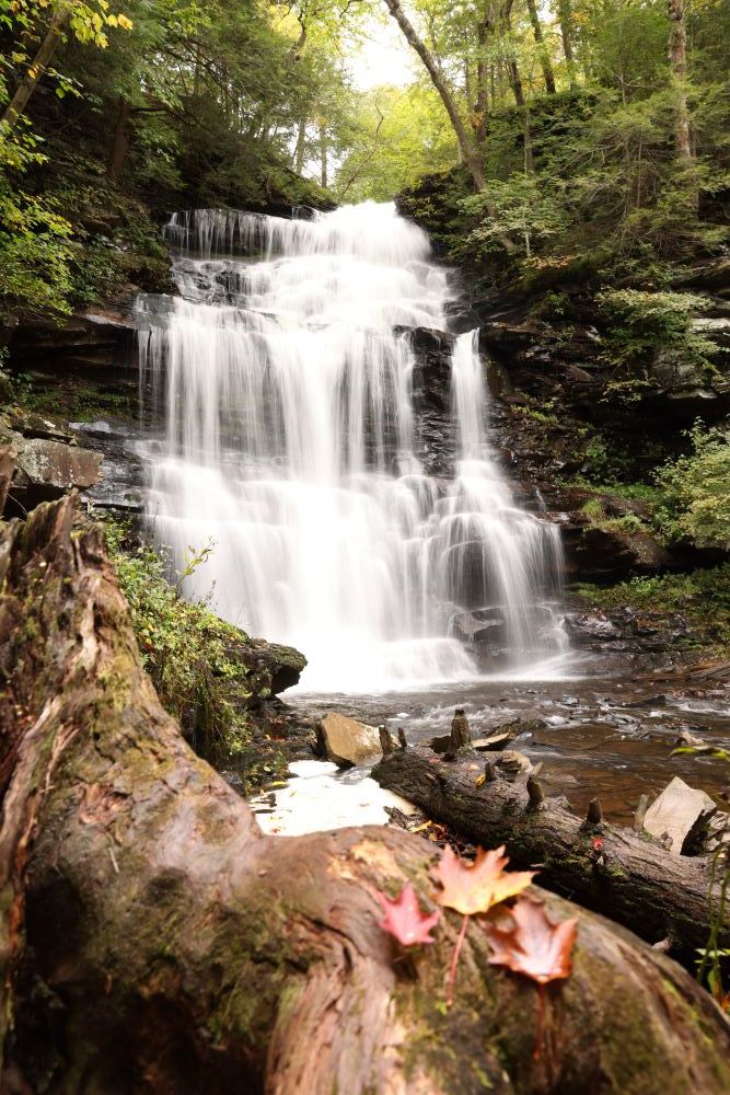
Erica, thanks for sending this one along, and
in many ways, it’s an excellent image. I like the interest in the foreground - especially those three leaves - which gives the photo a wonderful sense of three-dimensionality; I like the longer shutter speed, which has created that silky-smooth water; and I like your decision to include only a small amount of sky, which puts emphasis on the beautiful forest scene and keeps the viewer’s eye away from the overcast sky.
I also love the sense of seclusion - I don’t know how busy the area was when you photographed this, but it feels like I’m peering into an area untouched by human presence.
I have two notes for improvement:
First, the foreground is slightly soft, and as a result, I think you’re losing a little impact there. In general, I recommend keeping the entire image tack-sharp when photographing a scene like this one. You can do that by following one or more of the following guidelines:
- Focus at the hyperfocal distance (generally about a third of the way into the scene)
- Narrow the aperture (for landscape images, f/8 is often a good starting point, but for an image like this one - with a foreground element very near to the camera - you’ll want to go to f/11, f/13, or even f/16)
- Take a few steps back while keeping the focal length consistent
All of the above options will help
increase the depth of field (i.e., the window of sharpness within the photo), and you’ll get a sharper foreground as a result!
Second, it looks like
you have a few areas where you’ve lost detail in the scene. The water is pure white in several places, and elsewhere, the shadows underneath the rocks are pure black. (The sky is also pure white, but that doesn’t bother me; I like the more ethereal effect!)
I generally advise that you maintain detail throughout the scene (or, at least, that you only include a
small amount of this “clipping” effect). Fortunately, this is often an issue that can be corrected with a bit of post-processing, especially if you photograph in RAW.
Simply take your image into an editing program - such as Lightroom Classic - drag down the Highlights slider until you regain detail in those white areas, and drag up the Shadows slider until you regain a bit of detail in those dark areas!
Anyway, thanks again for sending this one along, and like I said, it really is a lovely
shot!
Next, we have a beautiful suburban landscape photo from Arabella F.:

Arabella, I love the composition, with the three
distinct sections of the foreground (the building, the pathway, and the trees). I also love the warm colors and softer shadows, which give the image a sense of nostalgia. And the details are wonderful - what a beautiful (and natural!) arrangement of plant pots and gardening implements in front of the structure.
This is the kind of image that (undeservingly)
often flies under the radar - rather than dramatic clouds or a jaw-dropping “decisive moment,” it has a deeper, subtler sense of beauty.
As for suggestions for improvement, I have a few thoughts:
First, it looks like you’re dealing with
a mix of late-afternoon sun and shade - shade in the foreground, but sun on the trees in the background. As a result, the tree in the background draws my eye, but I’d recommend keeping the eye moving throughout the frame if possible.
You could try taking a few steps to the right in order to block the brighter tree from view, though that might cause you to lose
the orderly composition you’ve created. Another option would be to come back when the lighting is slightly more uniform (and I do think a scene like this could look great on an overcast day!).
Also, while I love the soft tones in the foreground, I’d recommend a slightly different approach when it comes to processing the sky. On my monitor, the brightest areas seem
to have been blown out, and then pushed down pretty heavily. Sometimes, I think this can work really well, but because the sky is such an important part of this scene, I’d suggest reducing the effect a tad.
But overall, it’s an excellent image, and I love what you’ve created.
The next image, from Michelle B., features a gorgeous sunflower:

I don’t know if you know this, Michelle, but this type of macro image - with the soft-focus effect - is a favorite of mine. And Michelle, you’ve done an excellent
job here! I love your choice to get ultra-close, and I also applaud your choice of focal point; with this kind of approach, it’s easy to narrow the depth of field too much and lose that nice anchor point. (It’s also easy to include too many anchor points, but you’ve done a nice job of avoiding that, as well!)
I’m also loving the central part of the
background, which is both complementary and wonderfully soft, as well as the warm light.
Bearing in mind that you’ve captured a very nice shot already, one suggestion is to simplify the bottom left-hand part of the frame; right now, the combination of darker shadows, sharp sepals/leaves, and foreshortened petals is a tad chaotic. You could do this a few
ways:
- Photographing in slightly more diffused lighting (in complete shade or on an overcast day, for instance - though I do love that golden light!)
- Adjusting your angle slightly so that you're slightly higher and the petals are blocking the sepals
- Cropping up slightly from the bottom in order to eliminate the
distracting bit at the very bottom left
Well, that’s it for now! Thanks to everyone who submitted images, and if you have any images that you’d like to be considered for a future email critique, just hit “Reply” and send them along! As I said, I’ll likely include a critique in future newsletters.
(And if you’re nervous about your photos being displayed publicly, simply mention that you’d like a private critique, and I’ll do my best to accommodate!)
I hope you have a great week ahead (and, for those who celebrate, a great Thanksgiving!).
Talk to you next Saturday,
Jaymes Dempsey (and the dPS team)