Hi! I hope all is well! Over the past couple of weeks, I’ve had a lot of image submissions from readers, so I was thinking I’d keep today’s newsletter simple and focus on critiquing your files. Of course, before I delve into some fun critiques, I want to highlight the dPS bi-weekly challenge (details are below). Let’s dive right in! The dPS bi-weekly photo challenge:
Reflections in Nature From Sime: We have dabbled with reflections before now, but for this fortnight’s challenge, you need to find a reflection in nature. (Here’s a whole bunch on reflections from our blog) A fresh puddle on a road (watch out for cars!) A still lake or river, or even the bay (like my photo of Swan Bay, below) add trees or clouds for an interesting element. I find more minimalist landscapes work well with reflections, but that’s just me! Make sure you include the hashtags #dPSWeeklyChallenge and #dPSReflectionsInNature in your post, in the comments on our official bi-weekly challenge page, or over on social media. You can tag us on Facebook, Instagram or Twitter! Two more photo critiques As always, thanks so much to everyone who sent in images for critique; I encourage you to keep them coming, because I absolutely love seeing them. (For those of you who would like to see your images critiqued in a future newsletter, just hit Reply to this message
and send along a file or two! But make sure you mention that the images are indeed for critique in the email body or subject line, and please make sure the files are JPEGs and at least 1000 pixels on the long end!) First, we have a vivid winter landscape from Nosson S: 
What I like: - What immediately strikes me about this photograph, Nosson, is its clarity; everything is tack-sharp, from
foreground to background, and rendered very precisely. Even the water is sharp, rather than blurred using a long-exposure approach. All of this contributes to a sort of hyperrealism that really catches my eye!
- I like your use of color! You have a palette primarily of greens (the trees, which are complemented by the water) and blues (the sky, which is complemented by the cool-toned mountains). I think this kind of color harmony and simplicity helps make the entire scene feel
unified.
- I’m a fan of the overall composition, especially with that lovely sense of depth. You’ve done a nice job layering the foreground, midground, and background for added three-dimensionality, and the river acts as a leading line that moves the viewer’s eye through the frame, toward those distant mountains. I also like the wedge of trees on the right-hand side, which sort of echo the jagged shape of the mountains and push the eye inward.
Items to improve: - A couple of minor post-processing notes: the sky is looking somewhat unnatural on my monitor, especially on the right-hand side. While I like the bluish temperature, I’d recommend dialing it back slightly for a more natural effect, and I also think the clouds look a bit too contrast-heavy and well-defined. The snow also looks slightly blown out in places, such as on the inside of the river curve.
- Also, like I said, I really like the
color palette, but I’m wondering if those blues and greens are a little too intense. I think the color harmony will still work beautifully even if you were to desaturate the scene slightly.
- Compositionally, there are a few small distractions in the foreground, especially in the bottom right-hand corner, where some small twigs overlap with the river to create an area of confusion. I think the twigs could probably be cloned out fairly easily, but when in the field, you might have
been able to eliminate them by taking a couple of steps forward and/or raising your camera slightly.
- The overall shape of the composition, with that nice river curve, is solid. I do wish there were a bit more room along the left edge of the frame so that the foreground tree wasn't cut off. Alternatively, you could have tried going in tighter, focusing your lens on the distant curve of the river with the mountains in the background. You’d lose the depth provided by the foreground,
but the result might be interestingly graphic, with those jagged trees and mountains.
Second, we a lovely flower photo from Amelia A: 
What I like: - Amelia, I’m loving the details you captured here! The flower stamen is beautifully rendered, and the anthers surrounding the center, combined with the whirl of the petals around the flower, are
lovely.
- I also think you’ve done a great job of maintaining a single eye-catching focal point by keeping the flower sharp and letting the rest of the scene blur. It gives the viewer an anchor point, something to rest their eyes on and come back to as they move their gaze around the frame.
- Relatedly, I’m struck by that shock of vivid yellow at the center of the image, which is surrounded by more muted colors…as well as the way the reds at the corner of the petals are
echoed by the less intense reds in the background.
Items to improve: - I think you’ve done a nice job of filling the frame, Amelia, but I’d encourage you to take this even further; right now, the flower, as well as other out-of-focus branches, take up the center and left side of the image. However, on the right side, there’s a gap, and I can see what appears to be the blurry ground. I think this is
a bit jarring - it would be great if the main flower were surrounded completely by out-of-focus branches so the entire background felt equivalent. One way to do this would be to get in even closer; another option would be to move to the right while tilting your camera to the left, so the flower is backed by branches on the left rather than the area off to the right.
- With relatively symmetrical flowers, it can be very interesting to lean into the symmetry by getting directly above
the flower and pointing your camera downward. That’s not absolutely necessary, of course, but just something to consider for next time.
- There’s a small insect hiding between two of the petals that’s drawing my eye. That can be cloned out fairly easily, though!
Third, we another beautiful flower image, this one from Rosemarie C: 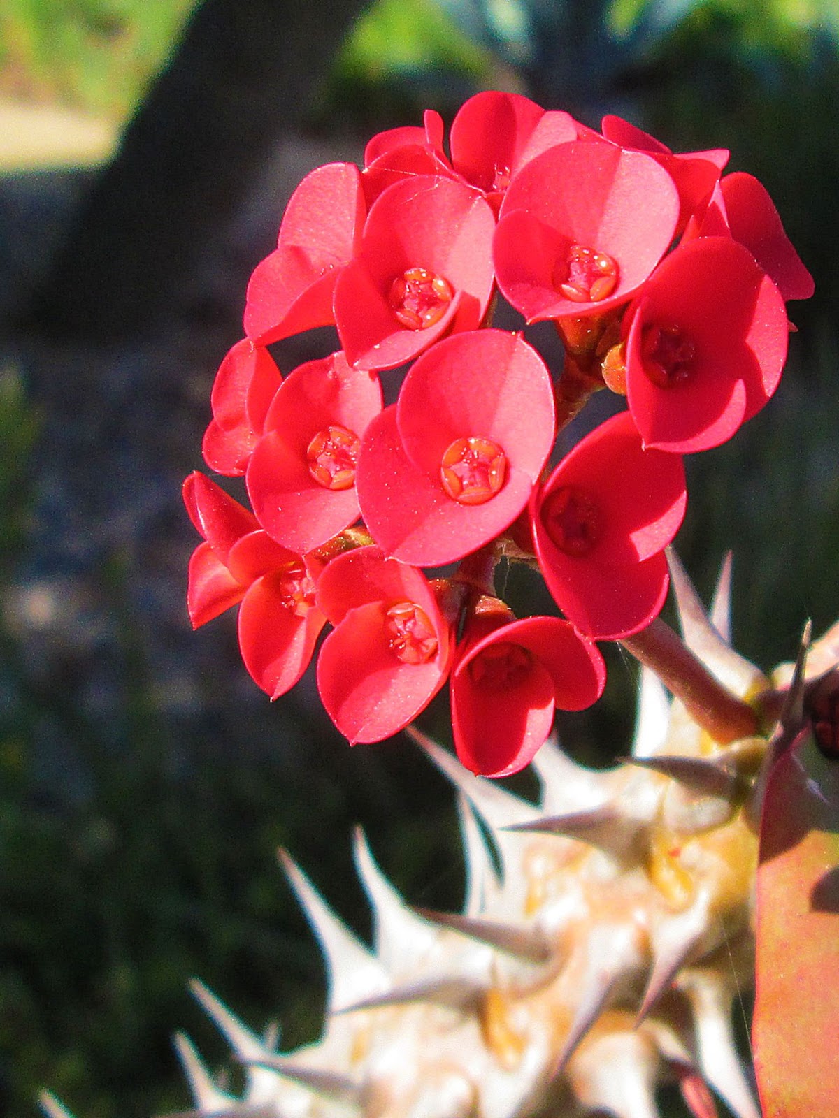
What I like: - Such vivid colors, Rosemarie! Those reds - which stand out even more thanks to the contrasting green background - are so eye-catching!
- Normally, I prefer flower photos to fill the frame and have a sense of stillness (which can be created through symmetry or simplicity). Here, though, I’m quite drawn to the jaggedness of this frame; the flowers are tilted up and to the left, and the stem forms a loose “Z” with the tree trunk in
the background and the thorny stem at the bottom of the shot. There’s just something really interesting about it!
- Great job keeping the main flowers in focus and establishing a focal point. The largest flower in the center of the group seems to be sharp and detailed, and it’s a nice place for the eye to rest.
Items to improve: - This is such an unusual image, Rosemarie, that I feel like the
normal “rules” don’t apply! That said, I’d encourage you to experiment with different types of light at different times of day. Here, it looks like you photographed when the sun was bright and high in the sky, and as a result, the image is very contrasty, and some of those reds, as well as the whites toward the bottom of the frame, seem slightly blown out. If you were to photograph on a cloudy day, you could get more diffused light that might flatter your subject more effectively. (Another
option is early morning or late evening light, which is also very flattering for flowers.)
- As I said, I like the jaggedness of your composition, with the zigzagging stalks and stems. But in general, I think it’s a good idea to consider a simpler, more formal approach, where you get in close and create a sense of harmony using various techniques (such as symmetry, which you could achieve by shooting down at the group of flowers from directly overhead).
- I also think the trees in
the background sort of work with the image as is, but in most cases, they would be a distraction. Just something to watch out for in the future - the cleaner the background, the better (in general, anyway)!
- I’m noticing a lot of noise speckles, especially in the blurry background. To prevent that, make sure to keep your ISO low, and get the exposure right from the start so you don’t have to try and recover shadow areas later on.
Well, there you go! Hopefully that was useful to you - and don’t forget to send in more photos for critique this upcoming week! Talk to you next Saturday, Jaymes Dempsey (and the rest of the dPS team) |
|
|