Hi!
I hope you’ve had a great week, and maybe had a chance to take a photo or two? This past Sunday, I spent the morning photographing buildings and street scenes in Downtown Detroit; it was my first time shooting in the city in a few months, and it was great to be back.
(I don’t know about you, but for me, part of the joy of photography comes from discovery - whether that’s a discovery of a new subject, or the
discovery of a new approach to capturing that subject.
Therefore, if I spend too much time with the same subjects and use the same techniques, the excitement starts to disappear. My images become a little too familiar. That’s when things start to feel creatively stagnant, and I struggle to find photos worth capturing.
When this happens, I’ll often deliberately try
to point my camera at something new: a new city, a new object, a new lighting scenario.
Then, if I return to the original subject - months or years later - I can approach it with fresh eyes, and I can appreciate it once again.
What I want to emphasize is this:
If you feel like you’re in a creative rut, that
might mean it’s time to move on from your current subject or approach, and that can feel hard. But just because you move on doesn’t mean you can’t come back - and when you do finally come back, you may find yourself creatively refreshed!)
Anyway, this week I wanted to keep things simple and focus on critiques; I have three to share, and I hope you enjoy!
Critiquing your photos
As
always, thank you to everyone who sent in images! And for those of you who would like to see your images critiqued in a future newsletter, feel free to hit Reply to this message and send along a file or two! Just make sure you mention that the images are indeed for critique in the email body or subject line, and please make sure the files are JPEGs and at least 1000 pixels on the long end!
Without further
ado, let’s take a look at our first image, a mesmerizing architectural scene from NC:

What I like:
- First of all, NC, I love the sense of depth in this frame, which you’ve achieved by including lines that recede into the distance, as well as a mix of foreground, midground, and background subjects. Plus,
your choice of a low angle makes the foreground loom larger, which accentuates the leading lines and the sense of receding space.
- I’m also a fan of the side/back lighting; not only does this add to the sense of three-dimensionality by carving out the structures, but it also creates a sense of drama that’s very cool.
- I appreciate how monochromatic this photo is - it’s mostly just shades of orange, and that simplicity helps push the viewer’s attention to other elements, like the
statues and details along the wall, as well as the tonal changes throughout the image.
Areas for improvement:
- To my eye, the image looks slightly tilted; fortunately, that’s a correction you can make quite easily in pretty much editing program! And while you’re at it, I’d correct any perspective distortion (i.e., crooked lines that are meant to be fully vertical).
- The sky on the right-hand side looks pure white, while the
sky in the upper left has some blue or gray peeking through. I kind of like the blown-out, detailless effect - it gives the image a hazier feel - but I’d be inclined to brighten up the rest of the sky so it all matches. (Alternatively, you could capture several bracketed frames and then blend them using an HDR technique; that way, you could maintain detail in both the darkest shadows and the sky.)
- I do think those distant treetops detract from the overall sense of harmony here. My recommendation would be to work on eliminating the trees entirely or ensuring that they’re a larger part of the scene (and thus don’t feel like intrusions).
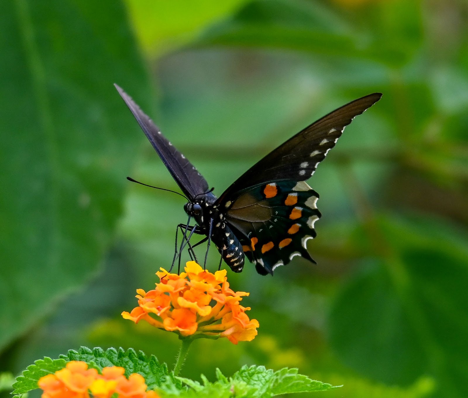
Next, we have a beautiful butterfly photo from KW:

What I like:
- What a beautiful subject, KW! The orange on the wings matching the orange flowers is lovely, and I really like how you’ve isolated the butterfly against a blurry backdrop. It keeps the eye on the subject,
which is generally what you want!
- You’ve chosen a very nice moment to shoot, with the butterfly’s wings spread partway. In insect photography, I think it’s easy to forget about the importance of the pose, but you’ve done a nice job here.
- On a related note, I like how you’ve ensured that the head is clearly visible and includes lots of detail; head/body turns are essential when photographing insects (or any animal!).
Areas for improvement:
- While I do like the uniformity of the background, and I think you’ve done a nice job preventing it from getting too distracting, if you could adjust your approach to achieve even more blur, that would be fantastic. Right now, I can still see the vague outlines of leaves, but if you were to get even closer to the butterfly (either by getting physically closer or by using a longer focal length), the background would blur even
more intensely and help emphasize the butterfly even more. Another option would be to widen your aperture, or you could adjust your angle so that the background was further away from the butterfly (when the background is farther away, it blurs more intensely).
- To my eye, the image is looking a little noisy/grainy, especially in the background. Lowering your camera’s ISO will help prevent noise, though if you’ve cropped this file fairly heavily, that could also be part of the
issue.
- Portions of the butterfly seem a little dark, at least on my monitor; I’d recommend lightening up those areas (or the entire image) to make sure you show off all the details!
- One more thought: When you’re composing images of a lone subject like this, work as much as possible to eliminate any elements that don’t add to the frame. I like how the lone butterfly is perched on the flowers, but the leaves and out-of-focus flowers in the bottom left are a little distracting, so
I’d encourage you to eliminate them if possible!
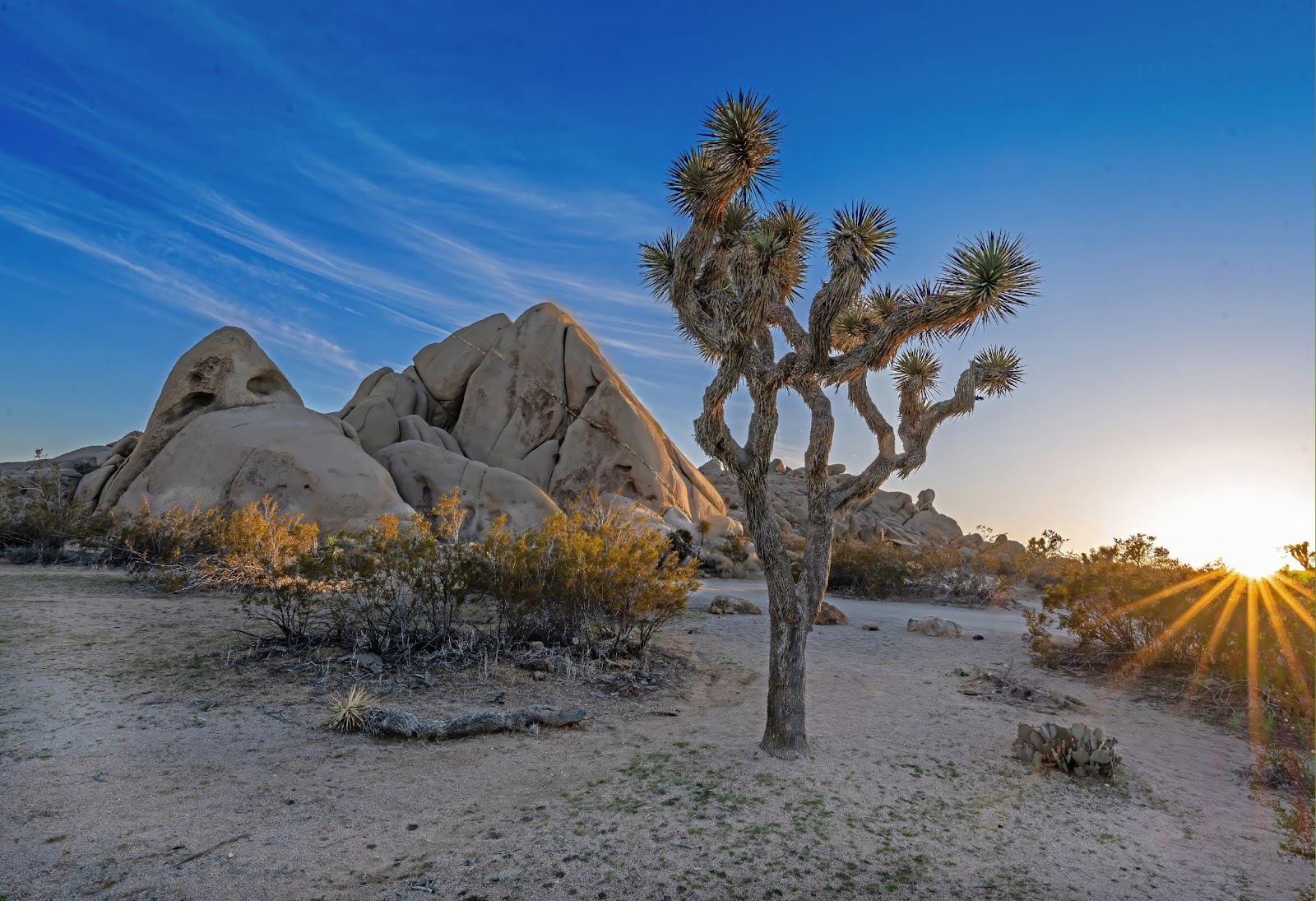
And third, a wonderful landscape from Bliss:

For this image, Bliss notes: “If I had the chance to take this photo again I would have tried to move to my left a little to get the tree more in the rule of thirds crosshair. However, I think this might have
run the risk of losing some of the sun's reflections on the mountain.”
What I like:
- What a picturesque scene, Bliss, and I’m loving that warm golden light falling on the plants and rocks; you’ve chosen a wonderful time to photograph this scene, and the sunstar is just icing on the cake!
- Some photographers might dislike the empty space in the foreground, but I
personally like it; it makes the shot feel very natural and real.
- You’ve done a very nice job of keeping everything in focus, from foreground to background - with a scene that features close foreground and distant background elements, that takes a narrow aperture as well as careful placement of your point of focus.
Areas for improvement:
- I do agree with your thoughts about the position of the tree; for me, the tree is
positioned a bit too close to the distant rocks, which makes that portion of the image feel a bit cramped. Repositioning the tree could also help isolate the middle portion against the sky - right now, it’s overlapping those distant rocks, and the combination of curling branches and rocks feels a little confusing to my eye. Getting down lower would also help with that, so that the busiest portions of the tree are framed by the sky. Your concern about losing some of the sunlight on the rocks is
valid, but you don’t necessarily have to move to the left to ensure that the tree is pushed to the right of the frame; if you walk forward a few steps, the foreground will splay outward as a result of perspective distortion, and the tree will automatically be placed farther to the right (assuming you continue to point your camera in the same direction). You may still need to move a little to the left in order to position the tree where you want it, but you’ll be able to retain more of the light
on the rocks with that approach.
- I’m sure some folks will disagree with me here, but I’d personally dial back the processing a bit. This frame has a classic HDR look with very bright shadows, very dark highlights, and heavily saturated colors. I can understand why folks like this effect - it’s very eye-catching - but at least for me, it detracts from the realism of the scene. For instance, while I think it’s good to include shadow detail, if the shadows are too bright, the image starts
to lack overall tonal contrast and loses that sense of naturalness. Also, heavy tonal adjustments can cause haloing in high-contrast areas, and I am noticing some halos alon the rocks and the tree in the foreground.
- One more minor note: You have some sensor dust spots that are visible in the sky! They’re quite easy to remove in post-processing, but some photographers prefer to have their sensor cleaned every so often to get rid of any problematic spots; it’s something to keep in mind for
the future!
Thanks again to everyone who sent in photos - that’s all for this week!
Talk to you next Saturday,
Jaymes Dempsey and the dPS Team