Hi!
I’ve been thinking a lot about the meaning of “good photography” - and about what it means to become a “good photographer.”
In other words: What makes one photo better than the next? Why is one photo “perfect” while another photo “needs improvement”? How does a photographer go about evaluating their own images (in light of different styles, subjects, conditions, etc.)? And how can a
person improve their photography in an overall sense?
In truth, I’m still wrestling with the answer. But when I’m struggling with a photographic topic, I often like to turn to the experts - such as the many incredible photographers who have written articles for dPS over the years.
And in case you’re struggling with similar questions, or even if you’re
simply looking for advice on how to get better at taking photos, I have a few articles to recommend:
- How to Know If Your Photography Is Good: The Art of Self-Critique
- How to Become a Good Photographer: 12 Essential Steps
- How to Pick Your Best Photos, Fast
I’m also excited to announce that Sime is back after a well-deserved break
- which means that we have a new bi-weekly challenge to share!
And as always, I’ve included a couple of image critiques below.
Enjoy!
The dPS bi-weekly challenge: golden-hour glow
From Sime:
We're back (well, I'm back!) after a couple of weeks away and we're going to jump straight in with the theme "Golden Hour Glow" from dPS FB Group member, Dennis
Maida. Thanks, Dennis. (You can find Dennis' website here)
Make sure you include the hashtags #dPSWeeklyChallenge and #dPSGoldenHourGlow in your post on the Weekly Challenge
page or over on social media. You can tag us on Facebook, Instagram or Twitter!
Two more photo critiques!
First, thank you to everyone who sent in images; I enjoyed viewing each and every one of them - and I hope to critique more in the coming weeks!
(And for those of you who would like to
see your images critiqued in a future newsletter, feel free to hit Reply to this message and send along a file or two! Just make sure you mention that the images are indeed for critique in the email body or subject line, and please make sure the files are JPEGs and at least 1000 pixels on the long end!)
First, we have a gorgeous sunrise photo from Peter:
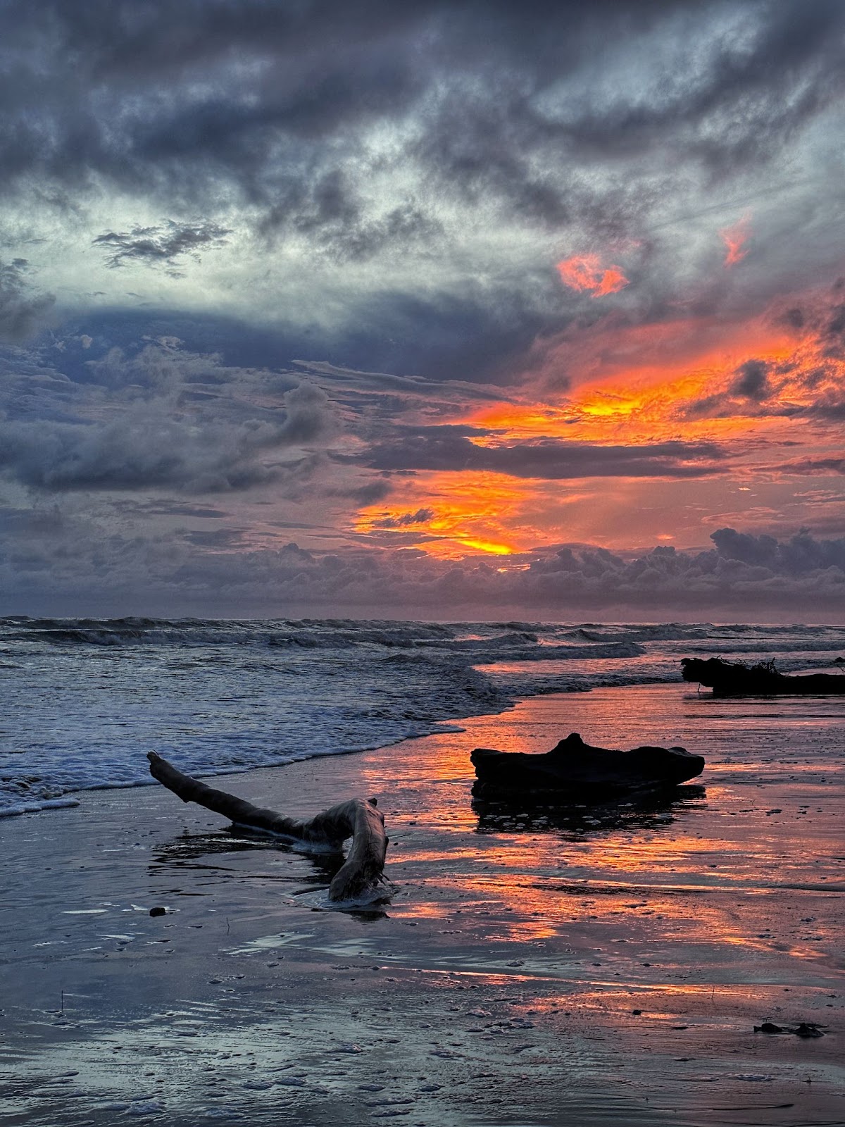
What I like:
- Peter, you’ve captured such a wonderfully dramatic sunrise here. Those clouds are incredible, and I love the way the choppy waves match the clouds above the horizon line.
- I also really like the sky reflection in the sand; not only does it add a pop of warmth to the cooler ground, but it also acts as a subtle line guiding the eye toward the drama in the sky.
- I’m also a fan of the sense of simplicity and space in this
scene. I like your choice of position and focal length; you’ve given each of those three logs room to breathe, while also setting up a rhythm as the eye moves from one to the next to the next. There’s also that interesting area in front of the logs, which is relatively empty. If you wanted to create a greater sense of tension in the shot, you could crop it away - or move forward while photographing - but I actually like how the negative space provides a feeling of expansiveness, scale, and
simplicity.
- Sometimes, it can be a bad idea to cut out a portion of your subject with the edge of the frame, but in this case, the cut-off log on the right works for me; I think it prevents the shot from feeling too static.
- One final note: You’ve photographed three logs here - not two or four! - which follows the rule of odds and looks great!
Areas for improvement:
- I’m noticing that the image is looking a little noisy/grainy, especially when viewed large. This could be caused by boosting the exposure in post-processing, though it also might be a result of a high ISO setting. If it’s the latter, I’ll be the first
to admit that photographing at sunrise can be tough, given the dim light, and it can be tempting for you (or your camera) to boost the ISO. However, in these situations, I’d recommend checking your camera settings to make certain that you can’t keep the ISO at a low value by dropping the shutter speed. If you regularly photograph landscapes in dim light, and if you don’t already have one, a sturdy tripod will make a big difference; it’ll give you the stability you need to drop your shutter speed
while keeping the ISO low, thus creating a sharp photo with minimal noise. (If it helps, here are some great tripods to consider!)
- I’m also noticing some exposure difficulties; in general, it’s important to maintain detail in all or most of the scene, from the brightest highlights to the darkest shadows. Here, the lighting is very tricky, but
the shadows on the logs are lacking detail. (If you photographed in RAW, you might be able to recover some of that detail when processing the image!) One trick is to capture several photos at slightly different exposures, then evaluate them afterward to pick the best. (And if you capture several different exposures with identical framing, you can also try blending the files together in a program such as Lightroom to ensure that your final image includes plenty of detail.)
- Related to the previous point, the tones in the sky are looking a bit unnatural. Those clouds are gorgeous, but I’d be tempted to tweak the highlights and shadows for more realism. (That said, if that’s what the sky looked like when you saw it, by all
means, keep it as it is!)
Second, we have a beautiful image of pelicans from Tyler:

What I like:
- First of all, Tyler, that warm light is amazing, both on their feathers and on the water. This looks like early morning or evening light, which is great for bird photography, and you’ve used it
beautifully here.
- I’m loving the contrast here; the pelicans are so bright, and they’re surrounded by that dark water, which helps emphasize your main subjects (plus, it’s very dramatic!). The reflections in the water are a nice touch, too.
- I’m struck by how the pelicans appear to be synchronized; you’ve captured them at a great moment, where they’re both doing the exact same pose! I’ve previously mentioned how difficult it is to effectively capture two birds in the same frame in
a way that ensures that the whole composition is harmonious, but you’ve done a great job!
Areas for improvement:
- Compositionally, I like your choice to put the pelicans high in the frame, which allows the reflections plenty of room, but I’d be tempted to crop just a touch off the left side of the image - that way, the amount of space on the far right and the far left would match, and the
image would have a stronger sense of vertical symmetry.
- This can be really tough to achieve with one bird, let alone two, but I do wish the pelicans were turned slightly more toward the camera; in general, if you can ensure that birds’ heads/beaks are at least parallel to the camera sensor, it’s ideal. That said, the identical poses make it less important here, at least for me - they’re interesting enough on their own, even without the full head
turn!
- Depending on the type of image you’re after, it could help to get lower down over the water, so you’re more on a level with the pelicans. On the one hand, that would make the reflections in the water stand out less. On the other hand, it would make the background fall away and blur more, which can be a cool effect. Again, it depends on what you’re after here - I like the angle you chose, but it’s just something to bear in mind!
- One more tiny point: On my
monitor, the brightest feathers, especially on the pelican on the left, look a touch overexposed, but you might be able to recover that detail in post-processing!
Well, that’s it for now - once again, a big thanks to everyone who sent in photos, and I hope you have a great week ahead!
Talk to you next Saturday,
Jaymes Dempsey and the
dPS team