Hi!
Did you know May is National Photography Month?
And to celebrate, dPS is running some dedicated deals - this week all eBooks from our library are only $7/each ( > 50% OFF).
Here in Michigan, flowers
are blooming in earnest, and the tulips in my garden are finally open! I don’t know about you, but when I see flowers, there’s nothing I want to do more than grab my camera and take a photo or three.
If you’re in a part of the world with flowers popping up left and right, I’d love to share a few dPS articles to help you get some fantastic floral photos:
- How to Photograph Flowers: A Beginner’s Guide
- 15 Flower Photography Tips for Gorgeous Results
- Guide to Choosing Subjects and Compositions for Flower Photography
- A Beginner’s Guide to Abstract Flower Photography
- 11 Best Lenses for Macro Photography (2024)
In fact, a few of those articles were written by yours truly, including the beginner’s guide to flower photography, which I updated just the other
week!
Anyway, I hope those articles are helpful! And if you don’t live in an area with blooming flowers but you do like photographing flora, why not use the tips and techniques to capture some beautiful indoor flower images? You don’t need a fancy studio setup to do “studio” flower photography; simply grab some flowers from the grocery store, put them in a vase near a window, and have fun with your camera!
Today, I have a new bi-weekly challenge to share with you all, and I also have a couple more photo critiques, so let’s get started!
The dPS Bi-Weekly Photo Challenge: L (the letter)
From Sime…
You’re lucky! I nearly went with SPRING just to be ironic (It’s Winter in 29 days here in Melbourne) but no no, this week(s) we take the “L” – A photo of an L, a photo with a main theme that says L or starts with L or sounds like sheer L… see what I did there?
L is for…. Landscape and Light and… whatever else you can come up with! Most creative will be
featured on our social media in two weeks!
Make sure you include the hashtag #dPSWeeklyChallenge in your post on the Weekly Challenge page or over on social media. You can tag us on Facebook, Instagram, or Twitter!
Two new photo critiques!
You all keep sending in photos, so I’ll keep critiquing them! As always, for those of you who would like to see your images critiqued in a future newsletter, feel free to hit Reply to this message and send along a file or two!
Just make sure you mention that the images are indeed for critique in the email body or subject line, and please make sure the files are JPEGs and at least 1000 pixels on the long end!
(By the way, if you do send images for critique, feel free to share your camera settings as well as any specific questions you have about the photos. I’ll do my best to address those items when critiquing the files!)
First, we have a moody urban landscape from Bill H:

What I like:
- First of all, Bill, I love the depth in this image. Your high vantage point, wide-angle perspective, and layering of foreground, midground, and background give the shot a wonderful sense of three-dimensionality.
- I also
love how detailed the shot is. You commented in your email that it was taken with your phone, and in my experience, phone images often lack fine detail, but you’ve done a great job of making the most of your phone’s sensor! The level of detail contributes to the sense of depth I mentioned above, and it also allows the viewer to get lost in the frame and appreciate all the different elements…
- Cityscape photographers often shy away from cloudy skies, but with the right approach, they can
work well. In this case, you’ve done a great job of exposing the image so you have plenty of detail both in the sky and the foreground. The detail in the clouds as they sit above the city adds a moodiness to the scene that I like.
- I think you’ve done a nice job of composing/structuring the scene; there’s that nice layering, yet the foreground, midground, and background also have a good sense of separation. The light waterfall in the center anchors the shot, while everything else moves
around it (for instance, the shoreline flows in from the left and then meanders around until it reaches the other side of the waterfall).
Areas for improvement:
- I’m seeing some perspective distortion, which was caused by your downward camera angle; it’s not extremely noticeable, but if you look at the buildings, you’ll notice them leaning slightly toward the edges of the frame. You can take
care of it pretty easily in post-processing, and while you’re at it, I’d check whether the scene is level - when looking at the image, I get the sense that it’s slanting to the right, but that might be an illusion.
- As I said above, I like the way you’ve composed the photo. However, I do have a couple of thoughts to consider. First, the large tree on the left-hand side of the foreground overlaps with the midground - for me, this works against that beautiful sense of depth you’ve achieved,
and it clashes with the loose symmetry that you’ve established. It’s not a huge deal, and you may have been seriously limited in terms of vantage points, but I do wonder how the image would look if you were to approach the scene from a slightly different angle. (For instance, if you were to move to the right and position your camera so the tree sits off to the left and frames the falls more clearly, the result could be interesting.)
- The edges of the frame are easy to overlook, but I do
encourage you to be very careful about how you “end” the scene. Objects placed along the edges without “breathing” room can draw the eye and create tension, like that light brown cubic structure on the right-hand side of the shot. And if you cut off objects, like that yellow structure above the rock wall on the left, they can also become distracting. Just something to bear in mind - in this case, you could perhaps crop in slightly on the left, while leaving the right-hand side completely
intact.
Second, we have an artistic beach scene from Moorthy V:
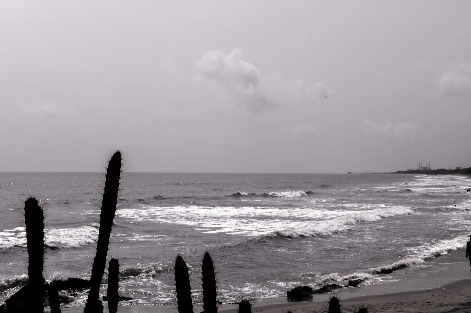
What I like:
- This is a really interesting shot, Moorthy! You have those dark, pointy cactus arms intruding on an otherwise peaceful beach scene, and while I generally think of foreground intrusions as distractions, those graphic branches are
rendered very sharply and clearly in a way that - at least for me - adds to the overall shot.
- I like the way those small clouds are well-defined in the sky - they maintain a sense of interest in the upper portion of the frame and also create a sort of triangular/circular flow between the cacti, the shoreline, the distant buildings, and the sky.
- It looks like you’ve shot this with relatively harsh sunlight. Normally, I recommend photographing in softer light - like the
kind you can find during the golden hours - but the heavy shadows and bright highlights, combined with your black and white treatment, give the shot an interesting graphic feel!
Areas for improvement:
- While I like the graphic effect created by silhouetted cacti, and I like how the longest arms are positioned against the water and horizon, I’d encourage you to
avoid chaotic overlaps with other portions of the scene - at the bottom of the frame, especially on the left, the branches overlap with those dark rocks in a way that’s a tad confusing/messy. If you have the opportunity to photograph this scene again, getting down lower and/or pointing your camera slightly upward to avoid including those rocks could make a big difference!
- There’s a silhouetted person cut off along the right-hand side of the frame, as well as two distant silhouettes just
at the frame’s edge - as I mentioned in the critique of Bill’s photo above, the edges are extremely important, and it’s generally best to avoid awkward crops or elements positioned right along the side. You could try going wider to give the people some space, or you could crop them out entirely!
- I’m noticing a lot of spots in the sky, caused by dust/dirt on your camera sensor. Fortunately, these are very easy to remove using a clone-stamp tool or healing brush during
post-processing!
- The distant horizon is looking fairly soft to my eye; this might be due to atmospheric haze, but it could also be caused by your choice of focus point. For scenes with a lot of distance between the foreground and the background, it’s often a good idea to focus around a third of the way into the scene in order to maximize sharpness. (I can’t say for sure, but it looks like the focus might be on the cactus branches; as a result, by the time the viewer gets to the
structures in the background and the horizon, the sharpness has faded.)
Well, that’s all for today, but I hope you have a fantastic rest of your weekend and a great week ahead!
Talk to you next Saturday,
Jaymes Dempsey (and the rest of the dPS team)