Hi!
This past Thursday, I had a few free hours with my camera. I’ve been feeling a little artistically uninspired as of late, so I decided to try something new:
Instead of using my wide-angle zoom, which is my go-to lens for photo walks, I went out with a lens of mine that I often leave at home, a 50mm f/1.4. (This
model, in case you’re wondering - and yes, I do highly recommend it!)
And as it turned out, that decision made such a difference.
Working with a prime lens instead of a zoom simplified my shooting process, plus it was fun to play around with the f/1.4 maximum aperture. Additionally, the longer focal length forced me to see the world differently than
usual, which was a fun challenge.
I’m not saying that you should go out and buy a fast prime lens. Rather, while lenses aren’t as critical as most photographers often claim, it’s important to recognize that your choice of lens (and camera, and tripod, and filters, etc.) will impact the way you photograph. Different lenses have different focal lengths, maximum apertures, and other features - so by switching from one
lens to another, you can open up new possibilities and even push yourself in completely new directions.
In today’s newsletter, therefore, I’ve included some helpful resources for choosing lenses, using lenses, and understanding how different focal lengths affect your photos.
I’ve also included our new bi-weekly challenge, as well as two more photo critiques!
Let’s dive right in:
The dPS bi-weekly challenge: Self
From Sime:
It's been a while, and so I thought it might be high time we had another
go at it! "Oh Fun' I hear you all chorus.
Self Portraits! They can be a basic snapshot with your phone, they can be a carefully planned, lit and executed photograph with a camera - We don't mind which option you choose to take, but we would LOVE you to think a little about your environment, how you want to portray yourself, for example, if you're a musician, maybe include your instrument, or perhaps you're a truck driver, set up a tripod (or sit your
camera or phone against a rock!) and get a photograph of you in your work environment.
Put a little thought into it and let's see how we go over the next two weeks, exploring 'self' You can share a series of images for this challenge if you choose to do more than one self portrait. (Up to 5 photos)
Remember to tag your post with #dpsweeklychallenge and #dPSSelf on our weekly challenge page or on social media! You can also share your images in the dPS Facebook group as the challenge is posted there each week as well.
Everything you need to know about lenses
Lenses can make a huge difference to your
photography, whether you shoot landscapes or portraits, products or flowers. These articles will help you use your lenses effectively - and if you’re in the market for a new lens, they’ll help you make the right choice!
- Choosing Lenses: When to Use Which Lens and Why
- The 3 Must-Have Camera Lenses Every Photographer Should Own
- 5 Creative Lenses for Beautiful and Artistic Photos
- What Is the Best Focal Length? A Comprehensive Guide
- Prime vs Zoom Lenses: Which Lens Type Is Best?
- 6 Tips for
Effectively Mastering Your Lenses
- 50mm Photography: Everything You Need to Know
Remember: You can get great photos with any lens. But by mastering the lenses you own, and by understanding the lenses available to you, you’ll be a far more effective photographer!
Two
more photo critiques
Last week, I took a break from critiquing photos from the dPS community - but I’m happy to report that I am back to critiquing once again! I have two more critiques to share, and I hope you enjoy them both!
(As always, for anyone who would like to submit images for critique in a future newsletter, just hit Reply to this message and send along a file or two! But
make sure you mention that the images are indeed for critique in the email body or subject line, and please make sure the files are JPEGs and at least 1000 pixels on the long end!)
First we have an intimate close-up shot from Lynn M: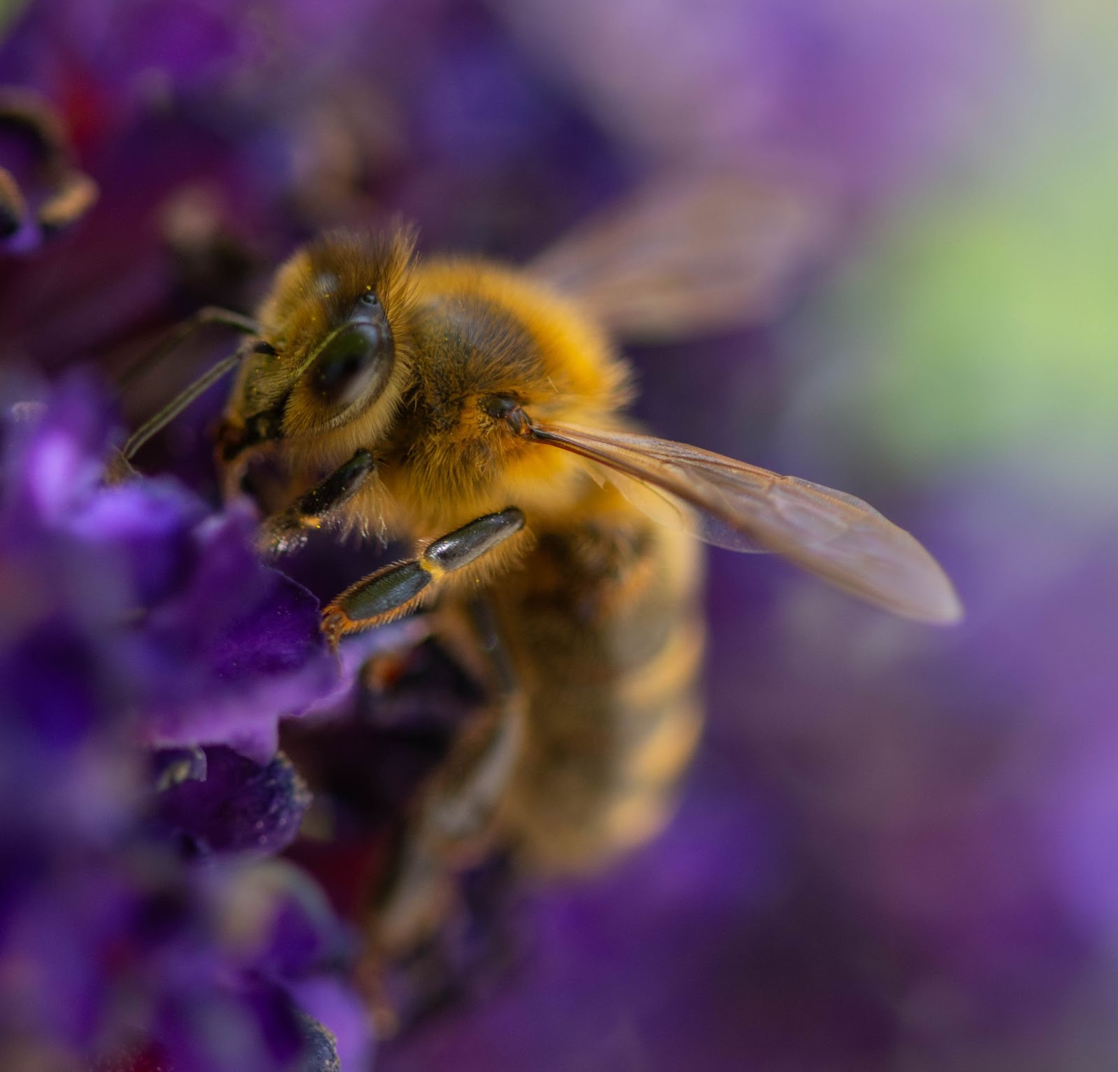
What I like:
- Lynn, what immediately strikes me about this image is the colors - they’re magnificent! The soft
oranges on the bee pair beautifully with the purples of the flowers. And the overall color palette is relatively simple, which I like. As I’ve mentioned in previous critiques, color is an often overlooked part of photography, but it can dramatically impact the final results, so it’s important to always take it into consideration when composing an image.
- I love all the little details: the hairs on the bee, the lines of the wing, the eyes and antennae. This is one of those macro photos
that shows the viewer something they might never notice or appreciate otherwise, which is great.
- I’m liking the blurry background, especially in the bottom right-hand corner; thanks both to the smooth bokeh and the rich colors, it complements the bee while also helping it stand out.
- Relatedly, I think you’ve done a solid job of isolating the insect from its surroundings - as a result, the viewer’s eye goes straight to the bee and doesn’t get distracted by competing
elements.
- I think the angle you’ve chosen to shoot this bee is great - you’re on a level with your subject, which makes the shot feel more intimate, and you have a slight turn so that the eye and head areclearly visible and prominent in the frame.
Ideas for improvement:
- When working at such close distances, the depth of field is very shallow, even with a relatively narrow aperture. That said,
I’d love to have a bit more depth of field, here - if you were to narrow the aperture further (and perhaps also focus directly on the eye), then some of the slightly unsharp areas (the eye, the front legs, and some of the wing) could be brought into tack-sharp focus. I like a shallow-focus effect, but I think it’s important to include certain sharp anchor points - generally the eye, and often other key features on a similar plane (so in this case, the legs, the spot where the wing meets the
body, and the front portion of the head/body).
- Related to the above point, nailing focus on a moving insect at high magnifications is ridiculously hard! Depending on your gear and settings, and if you’re not doing it already, it could be helpful to switch your lens over to manual focus and set your camera to its continuous shooting mode. If you set focus roughly where you want it, you can then gently rock back and forth as you hold down the shutter button; you’ll end up with a lot
of misses, but you may end up with a few great hits, too.
- I’m not sure how I feel about the green area in the upper right-hand corner; on the one hand, it’s so creamy, which I like. On the other hand, it takes away from the harmony created by the oranges and purples, and it also creates a break in that smooth background. (Depending on how you feel about cloning, that could be an effective approach - or you could perhaps move slightly to the right and shoot toward the left in order to
eliminate the green from the frame. Though if you did change your angle, just make sure you’re careful not to lose the intimate feeling you’ve created by shooting the bee from the side, with that slight turn toward the viewer!)
- One more thought: The composition here feels a little tight, and while I like getting such a close-up view, I think you could leave a bit more space around your subject, especially on the left-hand side, so the bee has “room” to move/fly forward. (Another option
would be to center the bee’s body more directly, which I think could also work nicely - with the eye along the upper-left rule of thirds power point and the tail end close to the bottom-right rule of thirds power point.
Second, we have a serene beach photo from Anne W:
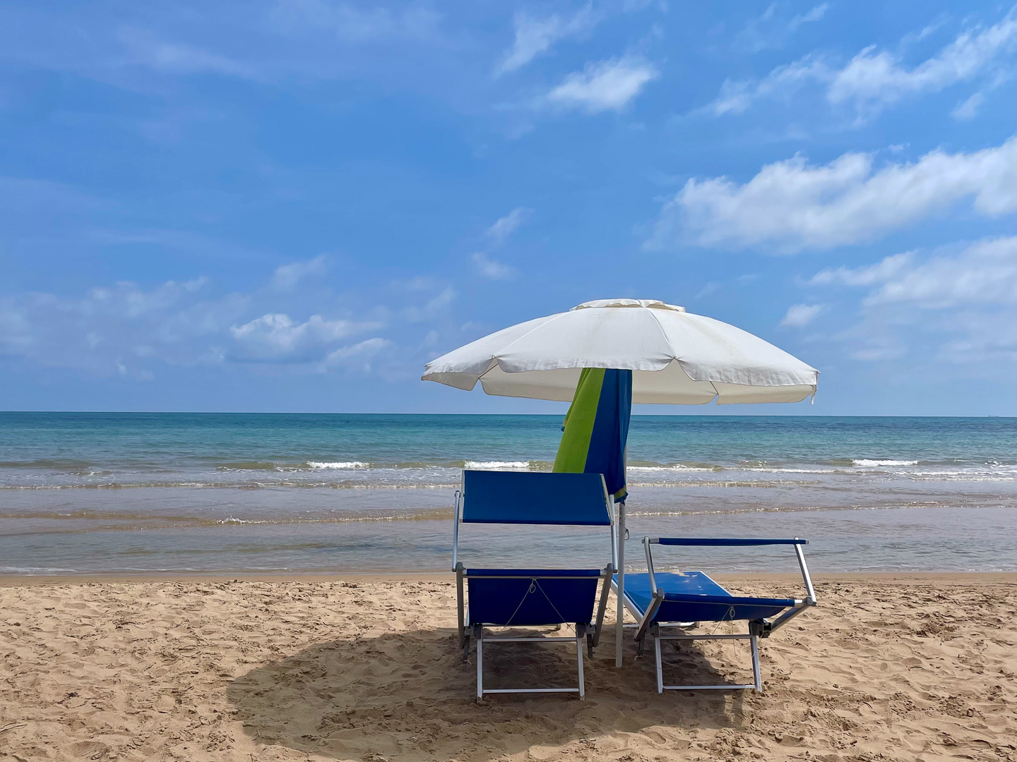
What I like:
- As you can probably guess from my lead-in, Anne, I like how
peaceful this image feels. The blue sky, the distant horizon line, the two chairs, plus that white umbrella…It makes me want to be there!
- I’m loving those clouds - they add interest to what could have been a very flat portion of the shot. And they also go nicely with the pop of white created by the umbrella.
- I like how you’ve composed so that the edges of the umbrella sit above the horizon line, while the chairs are clearly below; it keeps everything very clear and visually
straightforward. It might seem insignificant, but those interactions (or lack of interactions) between foreground and background elements make a huge difference to the overall sense of depth and clarity in an image.
- I like the simple composition, with the two chairs, the umbrella, and all the negative space surrounding those elements.
- The chairs and umbrella provide a bit of narrative interest, too, since it makes the viewer wonder how they came to be set up so nicely, and
whether they’re abandoned or about to be sat in…Plus, the empty chairs allow the viewer to imagine themselves walking into the scene and sitting down to enjoy some beach relaxation…
Ideas for improvement:
- It looks like this image was taken close to midday, and while that’s not always a bad thing, it’s resulted in fairly heavy shadows on the ground, especially around the chairs. The sand and water also has that harsher, higher-contrast
look that a high sun produces. I think this could look even more spectacular if shot earlier or later in the day, when the sun is low in the sky and the light is softer. (I’d also love to see how this scene looks just after the sun sets, during the ethereal light of blue hour…)
- As I said, I think this scene is serene as is, but I think you could enhance that sense even further by stepping back or going wider. The more negative space you can surround those chairs with, the better! (Of
course, depending on how busy the beach was, that might not be possible, but it’s just something to keep in mind!) The shadow on the ground is just touching the bottom portion of the frame, so I do think it could be useful to maintain a bit more space there, at least.
- A couple more composition thoughts: Right now, the chairs are sitting slightly off center, but I’m wondering if the shot might be stronger with those elements directly centered. An alternative would be to place them
slightly more to the side in the frame, and I think that could work, too, but ideally with the chairs and umbrella smaller in the frame. Additionally, while minor, I’d encourage you to pay careful attention to the placement of the waves in relation to the chairs and hanging towel - what you have right now works decently well, but the nearest wave line does intersect directly with the middle portion of one chair, which causes a bit of visual confusion, I think. (Dealing with waves is tricky,
given their unpredictability…One tip here would be to shoot in low light or use a neutral density filter so you can use a long shutter speed - that way, the waves become soft and blurred, and the lines they create are less noticeable!)
Well, that’s all for now, but I hope you have a wonderful week!
Talk to you next Saturday,
Jaymes Dempsey
(and the dPS team)